Interactive Charts

The following charts are interactive data visualisations from figures included in the book. These charts allow you to explore the underlying data or share them on social media. To view the interactive charts, click the respective figure title to expand (or close) a section.
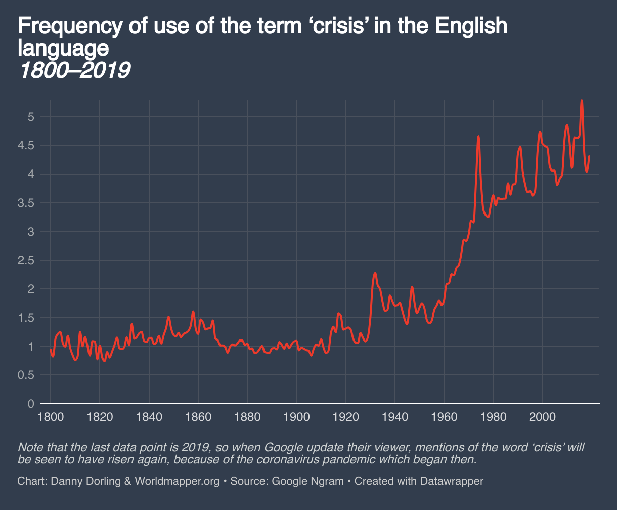
Figure 1.1: Frequency of use of the term ‘crisis’ in the English language, 1800–2019
Figure 1.2: What the rest of the world is most concerned about, 2022–24
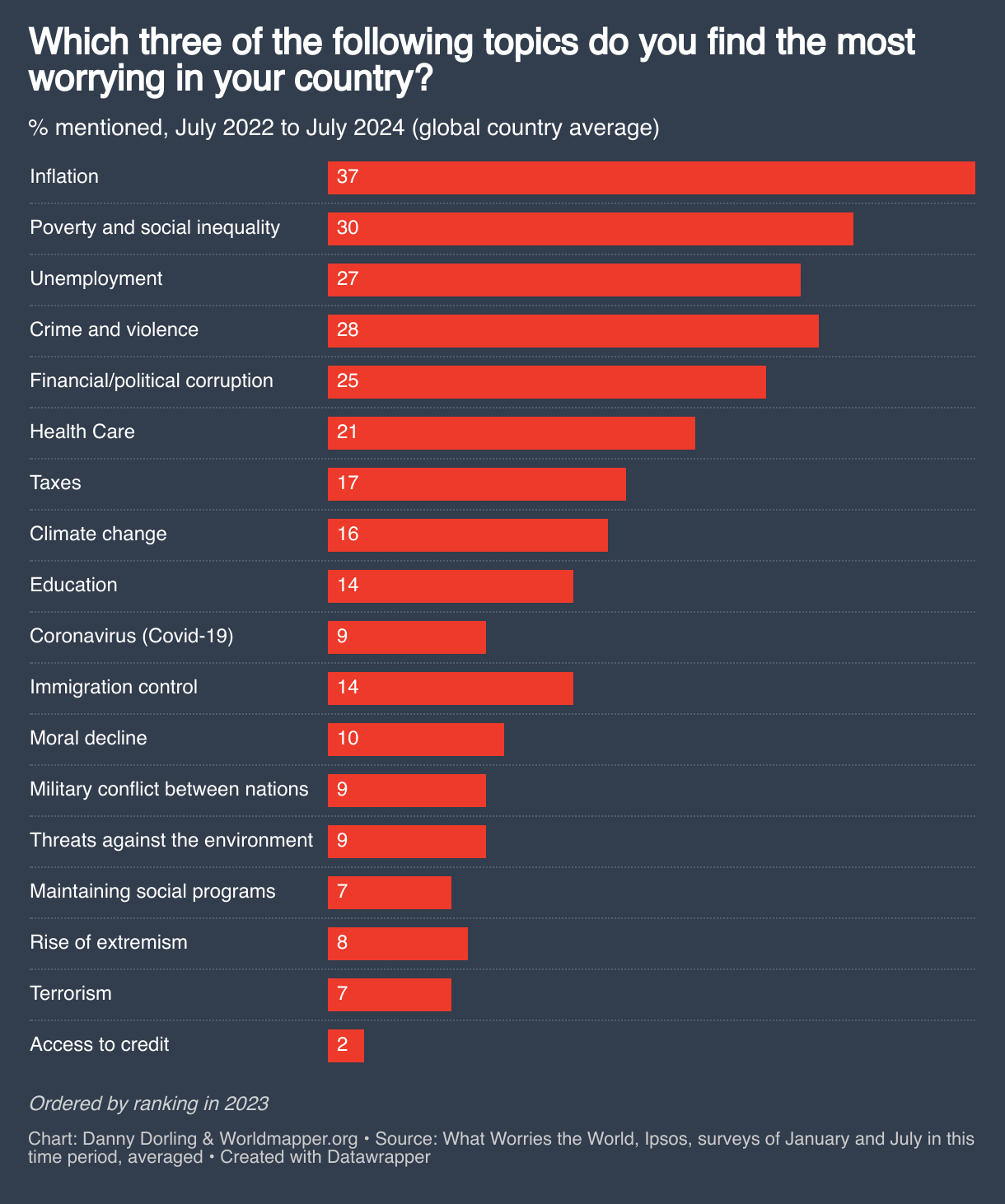
Figure 2.1: How economists tend to report global trends in poverty over time
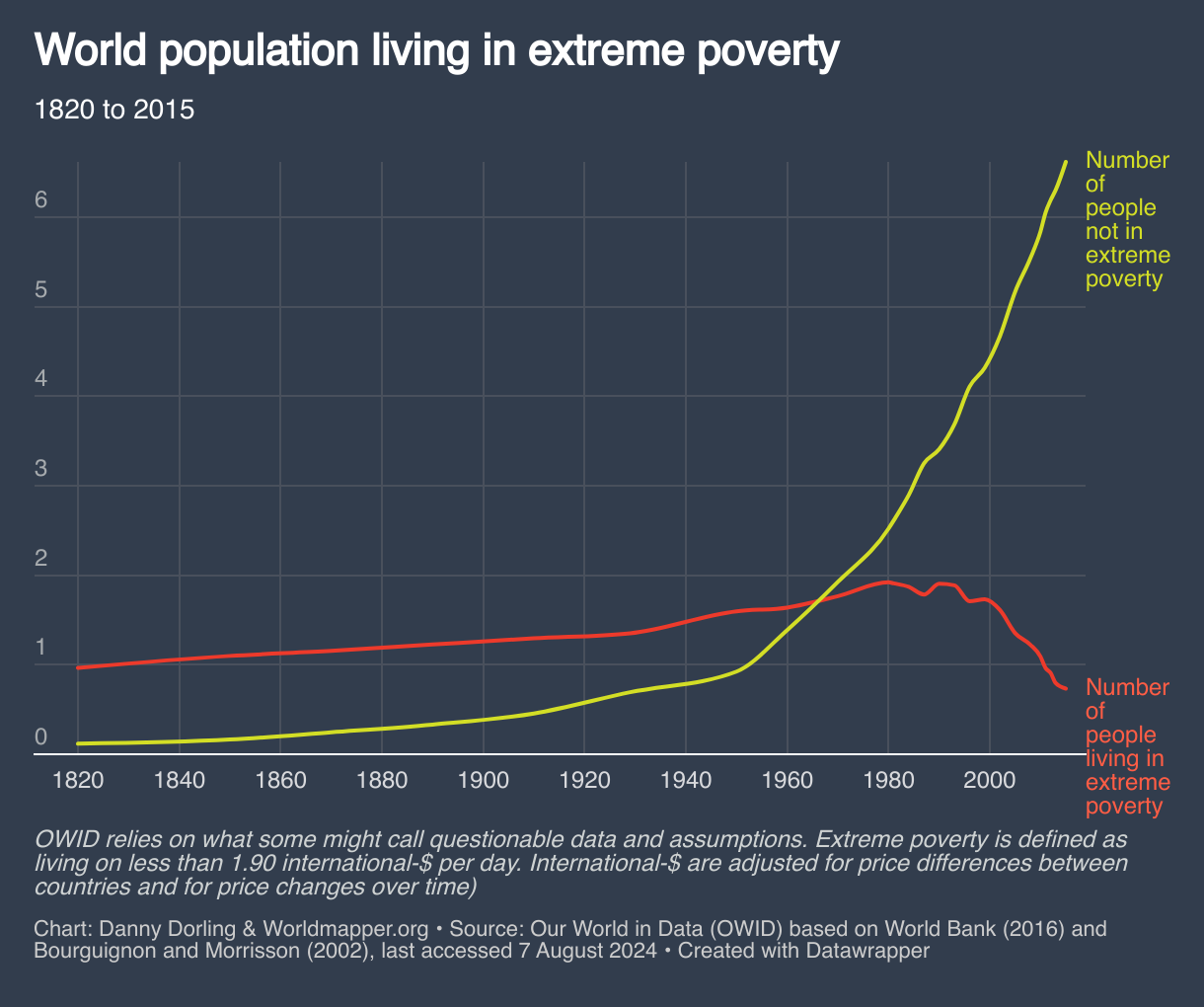
Figure 2.2: The reported rise & fall in extreme poverty in the world: an economist’s view
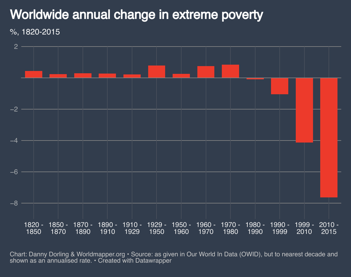
Figure 3.1: ‘Tick up to three issues’ – what people care most about, UK, 2011–24
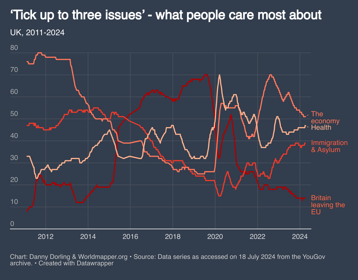
Figure 3.2: How size of birth cohort influences immigration and emigration
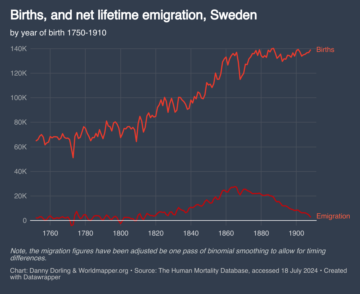
Figure 4.1: All deaths due to war in the world, by state, 1989–2022
Chart not yet available. It will be added soon, please come back!
Figure 4.2: Share of wealth for richest 1% in four countries, 1895 onwards
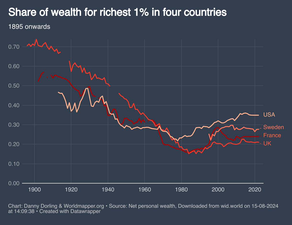
Figure 5.1: How much more likely people are to die in the US, by age, 2020s
Chart not yet available. It will be added soon, please come back!
Figure 5.2: How the US compares in terms of life expectancy trends over time
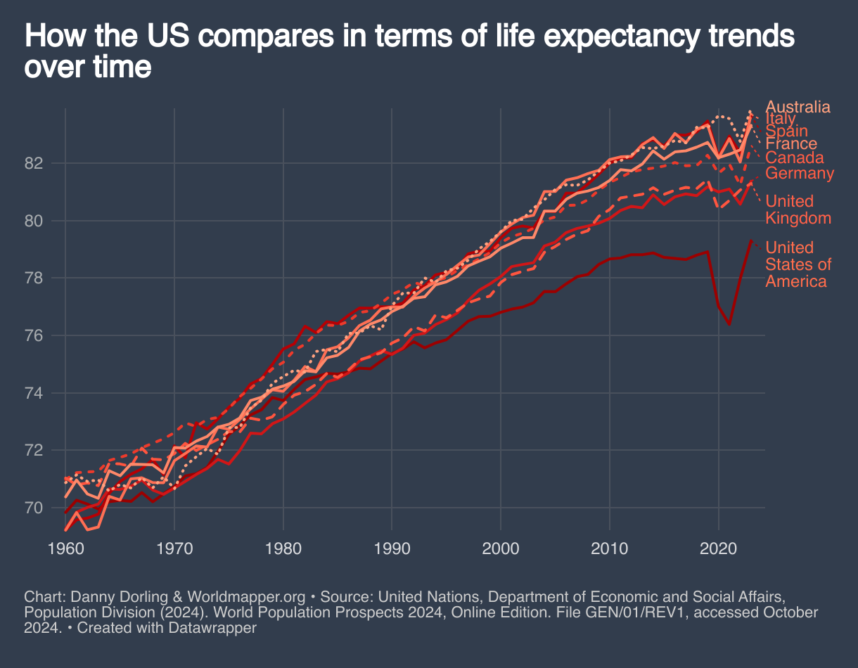
Figure 5.3: Life expectancy in US and England, by household income, in 2022
Chart not yet available. It will be added soon, please come back!
Figure 5.4: Adults who believe a single secretive group rules the world, 2021
Chart not yet available. It will be added soon, please come back!
Figure 6.1: Global emissions of carbon dioxide by income group, In 2019
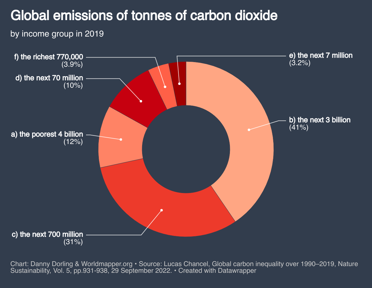
Figure 6.2: Location of people who believe climate change is a hoax, 2020
Chart not yet available. It will be added soon, please come back!
Figure 7.1: Cataclysmic scenarios for human population, 2020–2100
Chart not yet available. It will be added soon, please come back!
Figure 7.2: More cataclysmic scenarios for human population, 2020–2100
Chart not yet available. It will be added soon, please come back!
Figure 7.3: Going hungry is caused by poverty and inequality – not by droughts
Chart not yet available. It will be added soon, please come back!
Figure 8.1: Frequency of mentions of inequality, American Sociological Review, 1936–2019
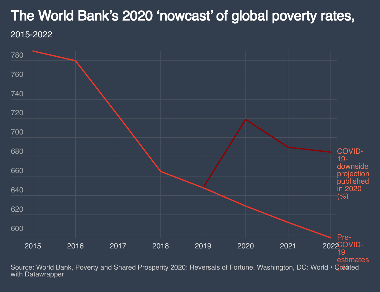
Figure 8.2: World Bank’s 2020 ‘nowcast’ for global poverty rates, 2015–22

Website by Worldmapper