Inequality and Social Deprivation: Examples of what goes wrong from the UK
I’m interested in inequality and what is happening with that.
I’m going to talk a bit about housing, the problem of getting housing.
A little bit about health, and the health crisis at the moment.
And I’m going to stick a bit about Brexit in – why not?
So I will definitely upset somebody.
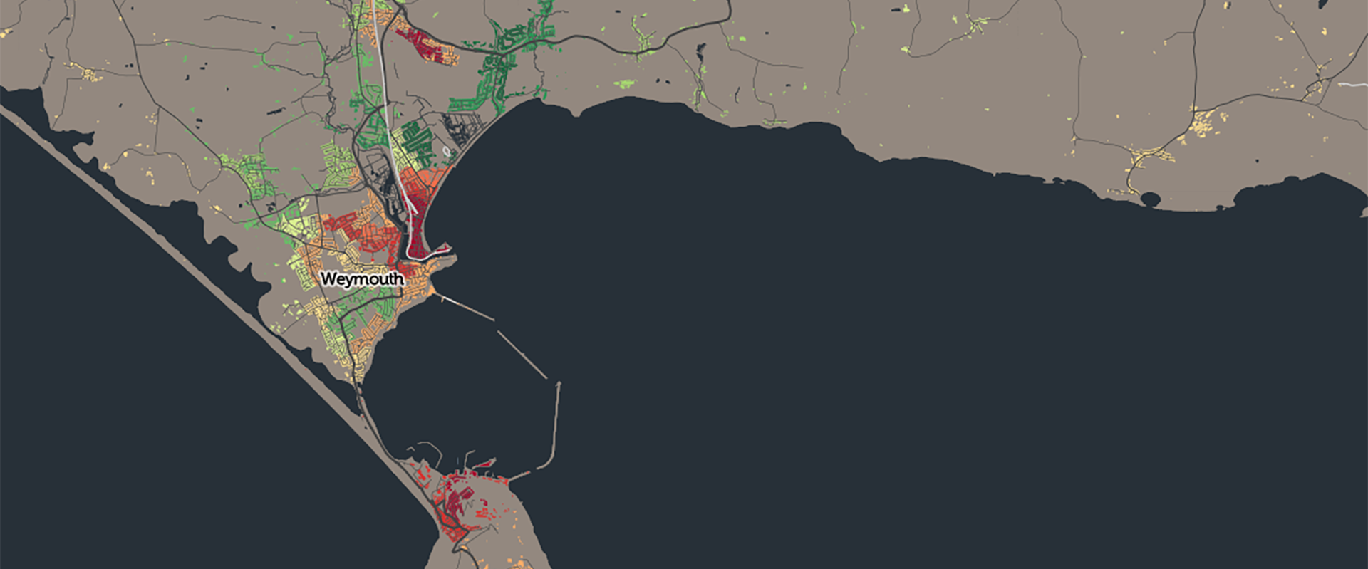
Whenever I go somewhere – and I have not been here before (but I have been down to the beech because it is where Geographers go and measure things) – I draw one of these maps:
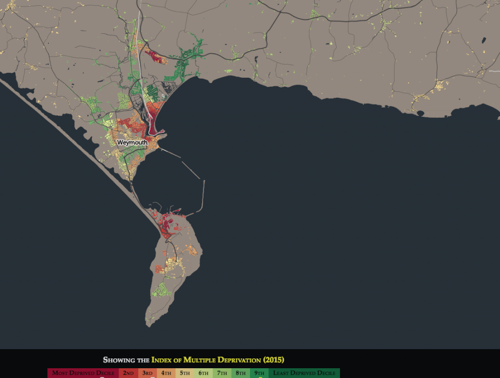
Weymouth and Portland (2015 deprivation index)
These are publicly available and they are quite interesting. It’s simply a map of the government’s [2015] deprivation index.
And this is an interesting area because normally an area of this size would largely be one colour or a couple of colours, but you’ve got more of a colour mix than most places so you should be proud.
You should have a sign up at the train station that says: “Welcome to Weymouth, the most socially divide small urban settlement on the South coast of the country.”
The dark reds are in the poorest tenth of areas, probably ex-council estates, but I could get it wrong. The green is the poshest and the dark green is the poshest of all.
To hear more click play below:
Danny Dorling speaking on Inequality and Social Deprivation: Examples of what goes wrong (from the UK), a Public talk for Weymouth & Portland Action on Wages – WeyPAW, Safewise, Weymouth, October 13th 2018
And find your own map here.